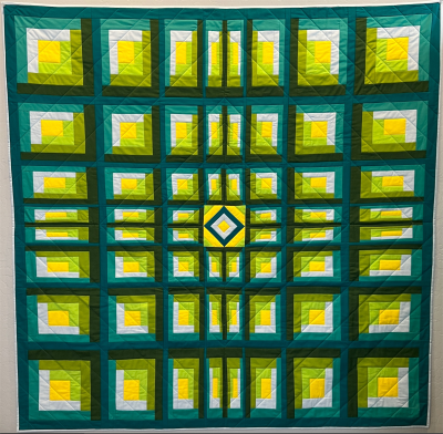
This quilt was originally created for "Quiltmaker" magazine. They were looking for new takes on old patterns.I choose a very, very vibrant color palette to move away from the more traditional colors, including a pop of bright yellow for the central home/hearth red theme usually associated with the pattern. I also wanted to create something of an optical illusion by changing the shapes and sizes of the cabins. It is supposed to appear as if you are looking down on the town, and as such, the magazine ended up calling it "Bird's Eye View." Either title works for me.